Web Design Trends That Will Be Huge In 2020
Web design has evolved so much in the last few years that the idea of new trends popping up anytime soon seems preposterous. How can website design change so rapidly?
Yet here we are, at the beginning of 2020, facing yet another year of trends that could revolutionise web design even further.
The innovative web design trends listed below are likely to become huge in 2020. Whether or not they’ll stay trendy for a long time remains to be seen, though.
Table of Contents
Introduction
1. Dynamic, responsive landing pages
2. Dark mode
3. Mobile first design
4. Huge typography
5. Colour phsycology
6. Micro animation
7. Split screen content
8. Voice user interface
9. Full screen forms
10. 3D modelling and rendering
Conclusion
1. Dynamic responsive landing pages
Landing pages have been static since the day they were conceived. And though the look of landing pages has steadily improved over the years, it’s still a relatively dull static page.
All that is going to change with the coming of more dynamic responsive landing pages.
Web designers will incorporate web animation and other interactive elements to landing pages, and that should make them more engaging, which is what they’re supposed to be in the first place.
2. Dark mode
We live in a world where a growing number of people are doing graveyard shifts, especially for online jobs outsourced to the other side of the world. Considering how working on a computer at night doesn’t require bright screens, web designers are leaning towards implementing dark mode in their work.
Some of the benefits of dark mode include reduced eye strain in low light conditions, better readability, and less screen glare.

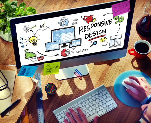
3. Mobile-first design
The idea of mobile-first design is not new. It has been around since the early part of the decade and started coming to a head when the number of mobile users surpassed those of desktop users in 2016.
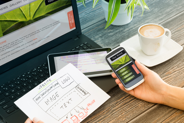
In 2020, it’s going to get even bigger, with more and more web designers opting to sketch and prototype websites on the smallest screens first, then work their way up to larger screens.
With mobile first design, web designers will be compelled to do away with the more extraneous elements of websites since they’re working on something for a small screen. That means they will only put in the most important thing, which, of course, is the content. They will only add other items when they start working on larger screens.
Mobile first design is meant to deliver content to the more numerous mobile users the fastest way possible. They won’t have to wait for other visual elements to load to get the information they want. And the faster they get what they want, the more likely it is that they’ll give you the conversions you need.
4. Huge typography
Many websites have been using big, bold letters on their hero images and section titles. Considering how good they are at drawing the attention of people to your brand and helping them remember it more vividly, it’s very likely that more websites will have them in 2020.
With huge letters on the main page of your website getting the eye of audiences fast, the time needed to make them give you the conversion you need becomes shorter too.

5. More use of colour psychology
Colour psychology has been in use in marketing for as long as anyone can remember. Many web designers also have an understanding of colour psychology and are mindfully incorporating the associations it makes between colours and human behavior in their work.
In 2020, more websites will knowingly use colour to elicit certain reactions, moods, and attitudes from their visitors, all geared towards results that will favor their business. Admittedly, though, different people tend to have varying reactions to colours based on their preferences and experiences.
Still, the links set forth by colour psychology between colours and human behavior ring true in most respects, like red being a great colour for creating a sense of urgency or blue having a calming effect on people.
6. Micro animation
The year 2020 will see the use of micro animations on websites become bigger and more widespread. As the phrase implies, micro animations are small animations that help users interact with a digital product. That makes them a rather powerful tool, and it can be quite fun, too, depending on the way you apply them to other aspects of your website.
7. Split screen content
In 2019, we have seen many websites feature a split screen. Many more sites will pick up on this trend in 2020 since it’s an excellent way of conveying more than one idea while keeping the overall look uncluttered.
If you’re thinking about doing this for your website, always remember to put a logo, a menu header, or any other visual element at the center of the screen to balance everything out and give the page a focal point.
8. Voice user interface
With the ever-growing popularity of voice search and Siri, Google Now, Alexa, and other smart virtual assistants, it only makes sense for web designers and developers to provide voice-capable interfaces to make sure voice search users get the best possible experience.
With voice user interface, website users, including vision-impaired ones, get a hands-free, eyes-free way of interacting with a product, even with their attention focused elsewhere.
9. Full-screen forms
It’s true that very few people enjoy filling in online forms, especially when the fields are a little too small, which is almost always the case. Considering how instrumental these forms are to lead generation, web designers are entertaining the idea of making forms big (full-screen big) in 2020.
With bigger than usual forms, people can see what’s being asked of them more clearly and effortlessly, which can make them more likely to fill those forms in and give you that precious lead.
10. 3D modeling and rendering
3D technology has been around for some time now, but few websites have been using it for their web design, for the simple reason that doing so can be very expensive.
However, with experts saying 3D modeling and rendering will become more affordable, we can expect webmasters to go for it because having 3D on your website is cool, and will draw in more people.
Conclusion
These are just some of the web design trends that will make a splash in 2020. Which ones do you think will prove to have staying power, and which ones will just fade away?

Daryl Smart
Daryl has an avid interest in website designs for small business. Having come from a small business background himself, he understands the concerns and frustrations small businesses experience when trying to develop their online presence.
